

Spring is the perfect time to refresh your home with vibrant and cheerful colors. A thoughtfully chosen palette can make decorating effortless while bringing warmth and energy to your space. From soft pastels to bold, playful combinations, there’s a spring palette for every style. This guide breaks down 30 stunning spring color ideas, complete with budget-friendly tips and easy DIY ways to apply them around your home. Whether it’s a living room, bedroom, or kitchen, these ideas will inspire creativity and make your space feel inviting.
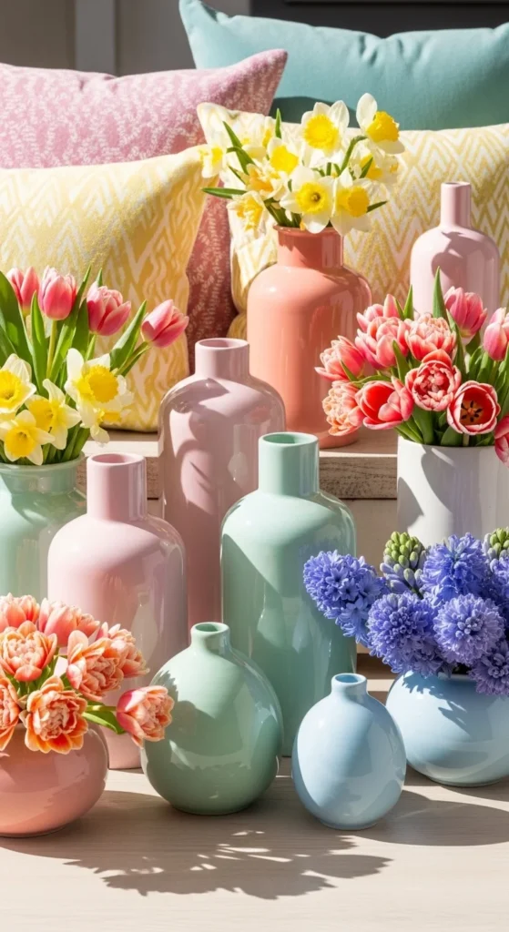
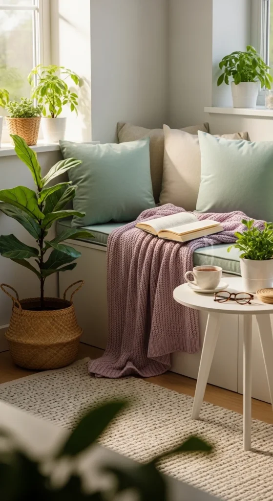
1. Soft Pastel Mix
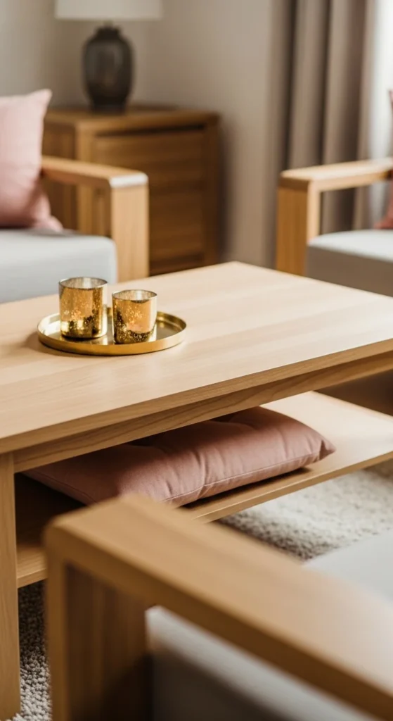
Soft pastels create a light, airy feel perfect for spring. Think pink cushions, mint throws, and pale blue vases. These shades are easy to mix without overwhelming your space. You can paint a single wall in a pastel hue or swap out small décor items like rugs, pillows, or picture frames. Even a few budget-friendly pastel candles or artificial flowers can lift the room instantly. Mixing three pastels keeps it playful but balanced. Try adding wood tones or white furniture to prevent it from looking too sugary. For DIY, consider hand-painting pastel stripes on plain ceramic pots or creating a pastel-themed gallery wall with inexpensive prints. This palette works well in bedrooms, living rooms, or even home offices for a subtle, cheerful vibe.
2. Fresh Green and White
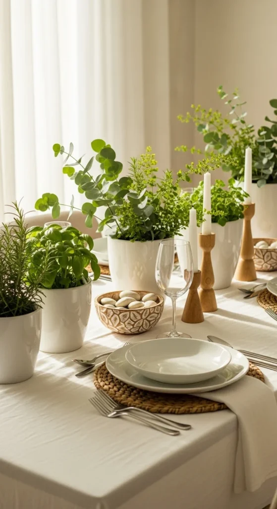
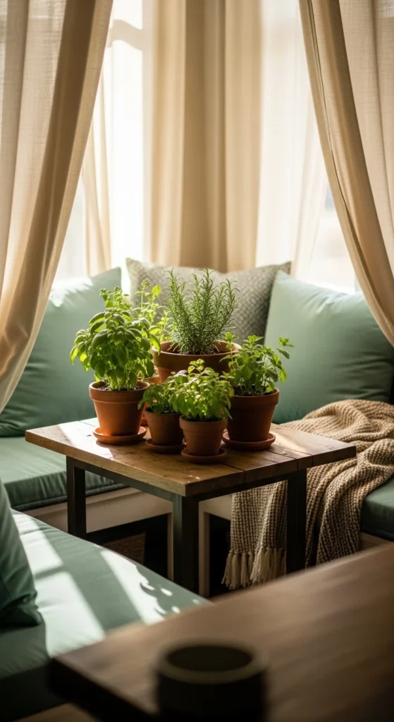
Green and white is a classic spring combo that feels clean and natural. Use potted plants, leafy garlands, or green kitchen towels alongside crisp white furniture or linens. This pairing brightens spaces and adds a calm, inviting atmosphere. For a low-cost update, repaint old furniture white and add small green accents like vases or cushions. A DIY touch could include pressing leaves in frames or creating a green-and-white tabletop centerpiece. This palette works anywhere—kitchen, living room, or entryway—and pairs well with natural materials like rattan baskets or light wood. Keep the green tones varied, from pale sage to deeper forest hues, to create depth and dimension.
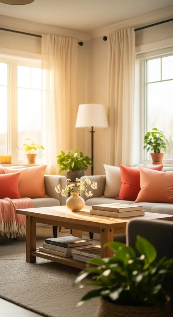
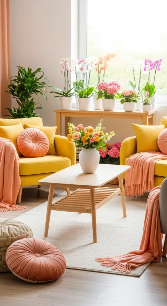
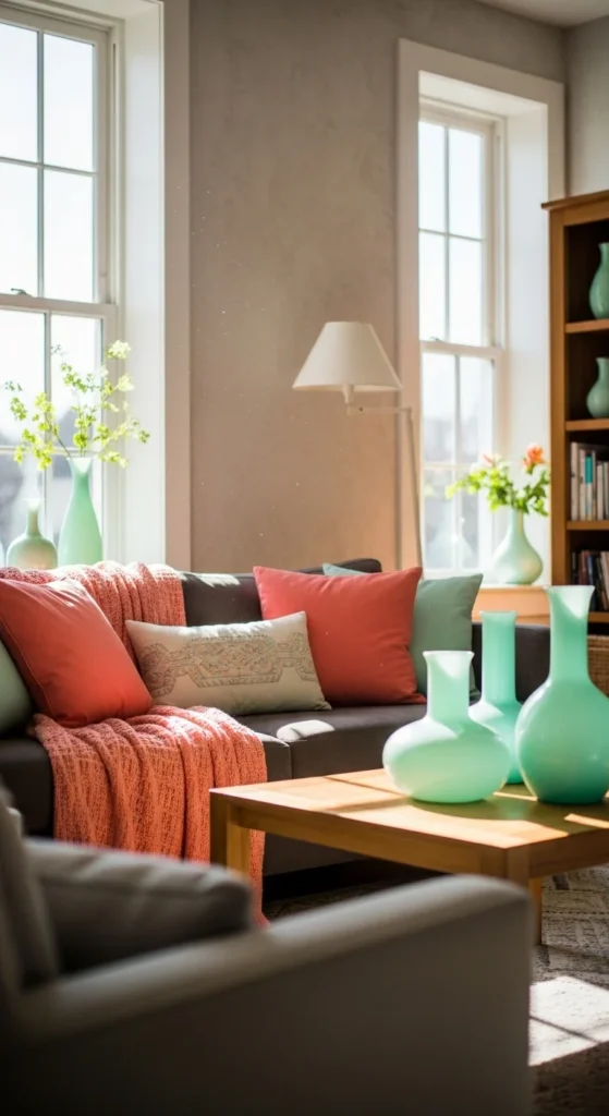
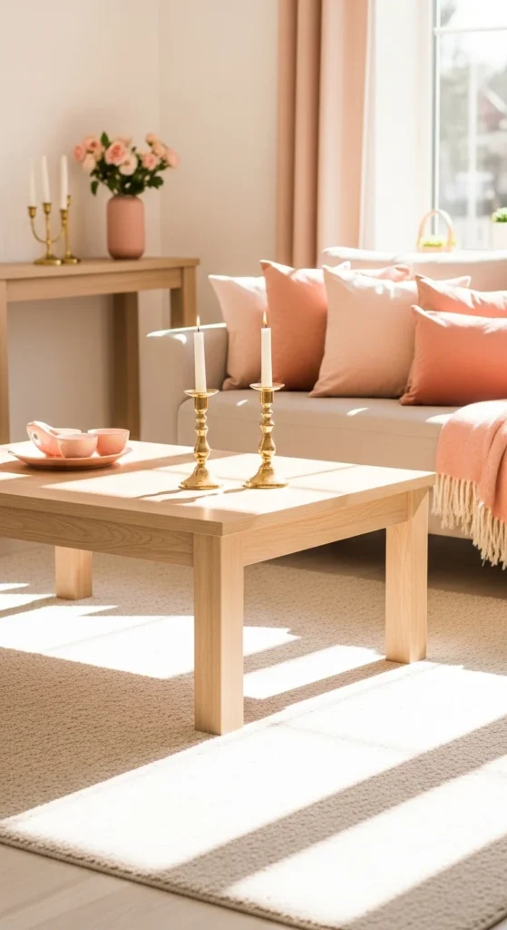
3. Coral and Peach Hues
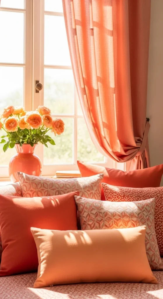
Coral and peach bring warmth without feeling heavy. These shades are perfect for accents like pillows, curtains, or vases. Start small with affordable textiles—a throw blanket or table runner can instantly add a splash of color. For DIY, paint terracotta pots in coral shades or create peach-toned floral arrangements. Pair with neutral tones like cream or light wood to balance the vibrancy. Coral and peach are cheerful for a living room or bedroom. If you’re feeling bold, a statement wall in a muted coral can set the tone for the season. Mixing light and darker coral shades adds dimension without cluttering the space.
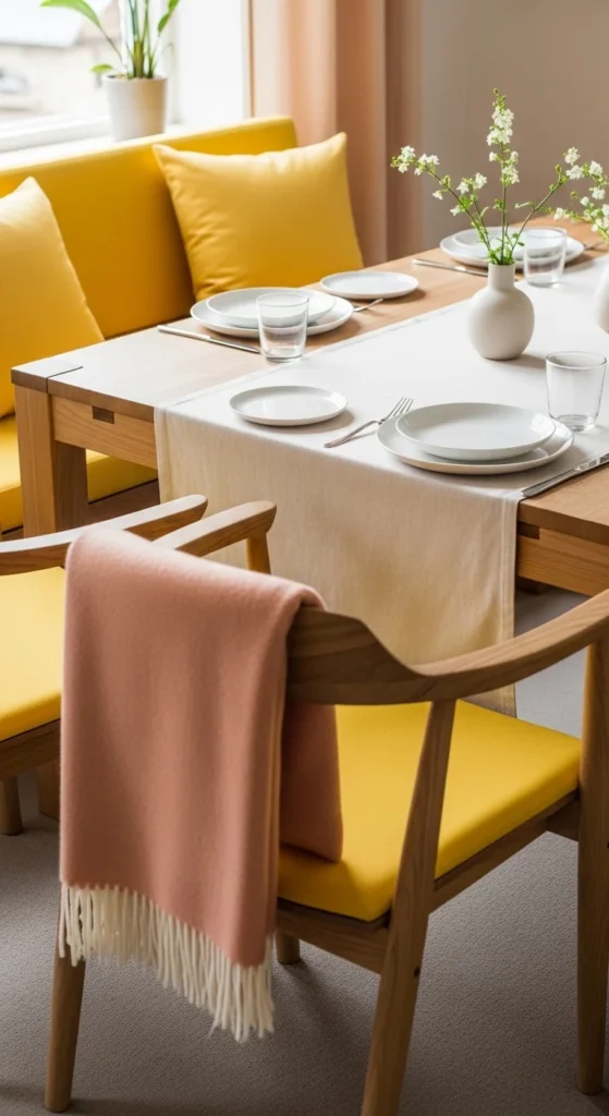
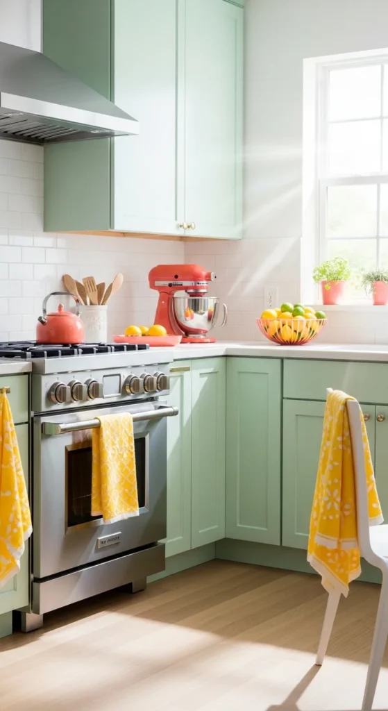
4. Lemon Yellow Accents
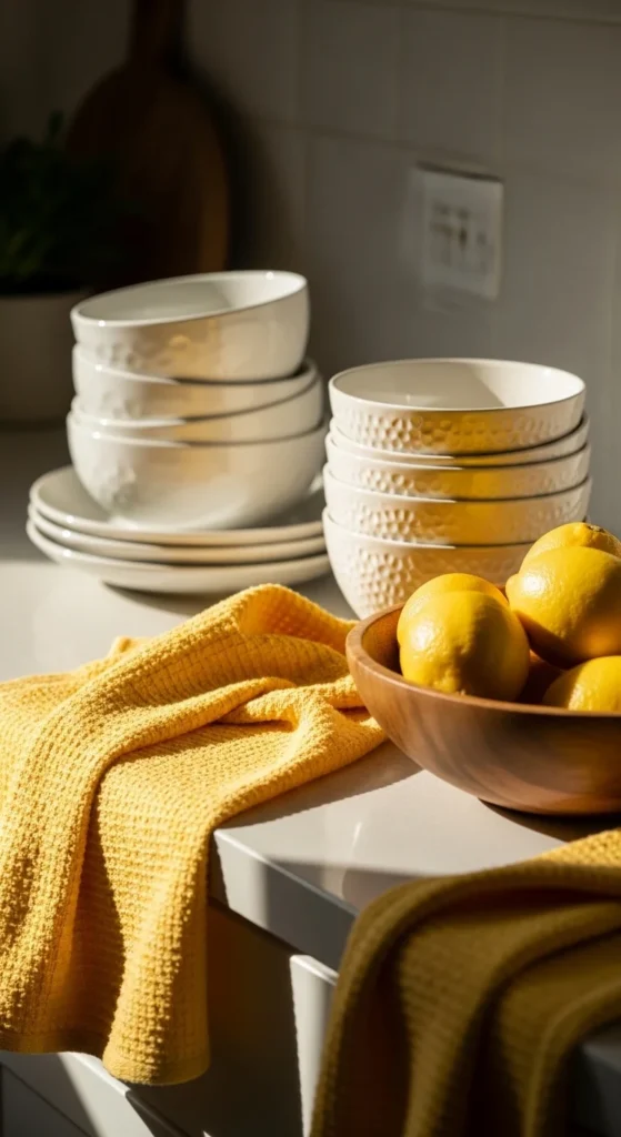
Lemon yellow instantly brightens any room. Use it sparingly as an accent on pillows, rugs, or small décor pieces. A kitchen or dining area benefits most from this cheerful tone. DIY ideas include painting mason jars or candle holders in yellow. Pair yellow with soft gray or white to prevent it from feeling too intense. Even a few small, inexpensive details like yellow napkins or fresh lemons in a glass bowl can lift the mood. The key is balance—too much can overwhelm, but subtle touches create a sunny, welcoming vibe.
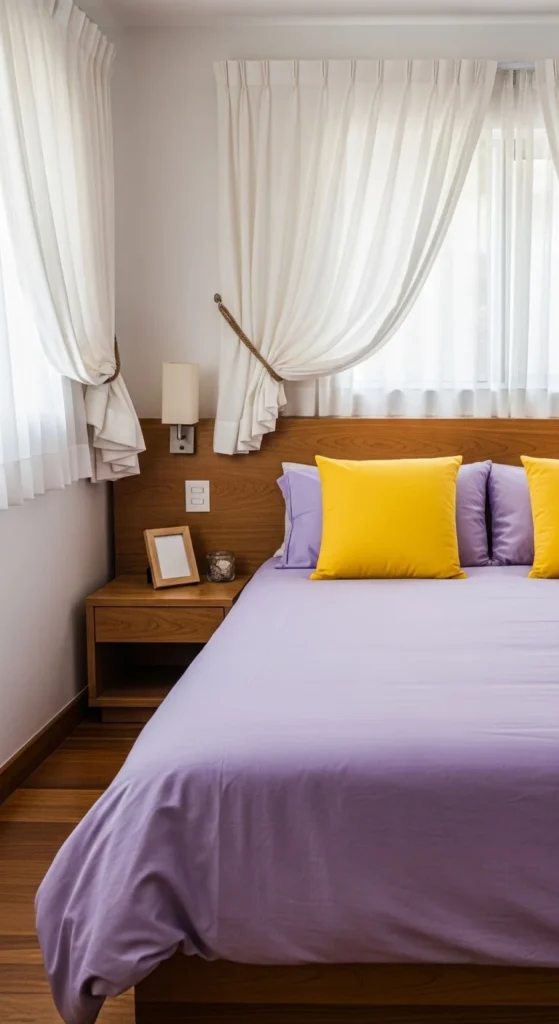
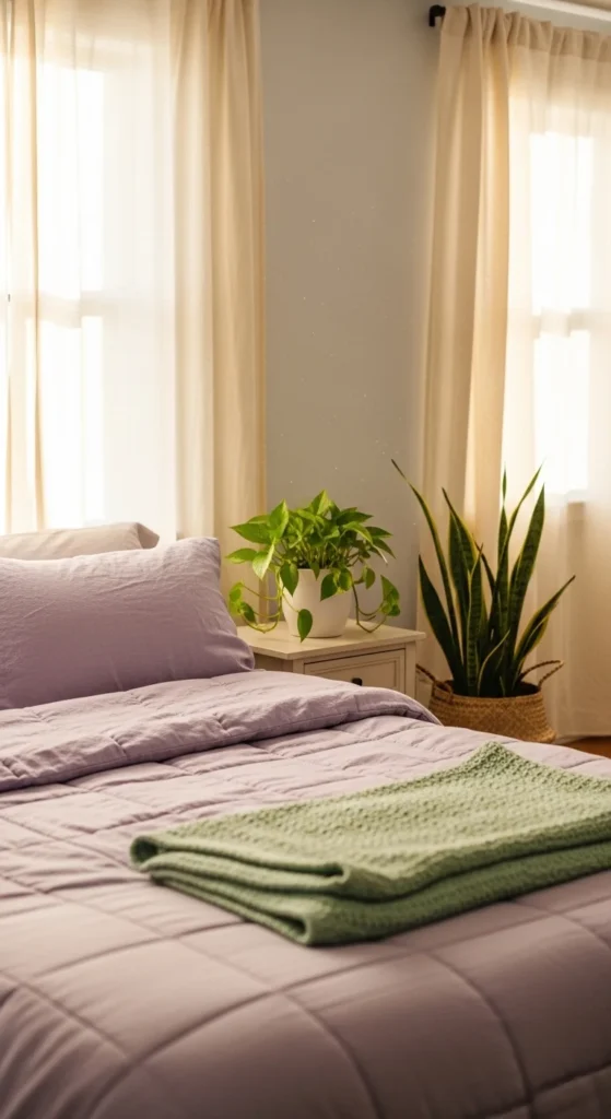
5. Lavender and Lilac
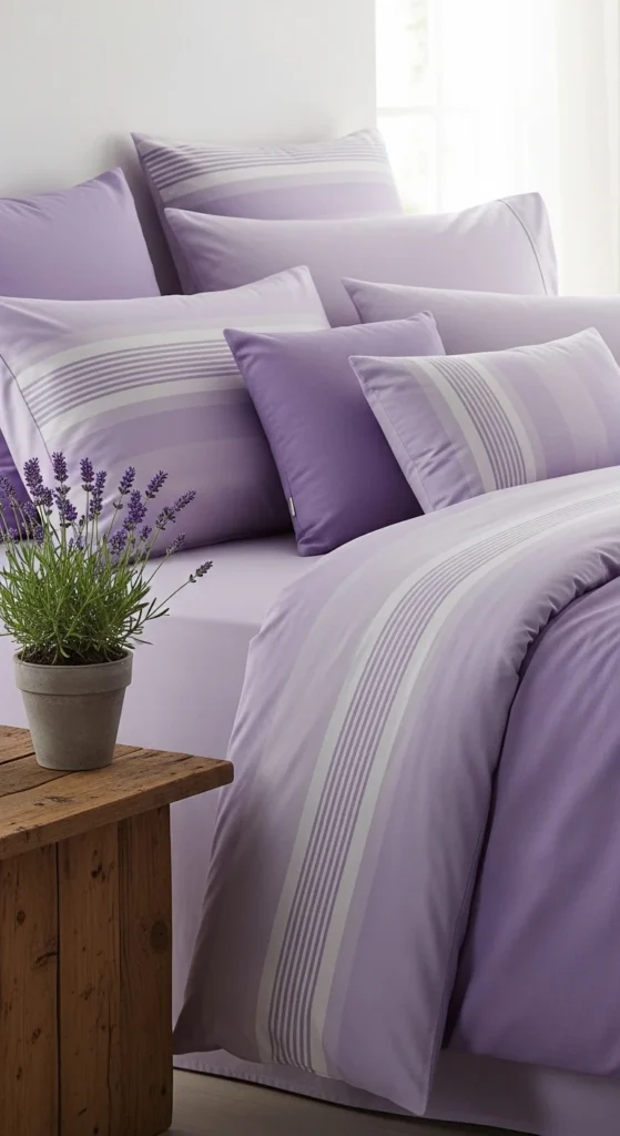
Lavender and lilac are soothing yet playful. Perfect for bedrooms or reading nooks, these shades pair beautifully with light neutrals or soft gray walls. You can swap out linens or cushions to bring this palette into your home without major expense. For DIY, paint small wooden frames in lavender shades or create a lilac-themed candle arrangement. Adding fresh or faux lavender stems enhances the effect. Mixing lighter and deeper shades keeps the space interesting. This palette is especially calming and creates a peaceful spring vibe.
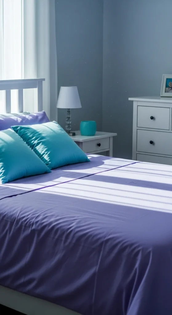
6. Sky Blue and Soft Gray
Sky blue paired with soft gray feels airy and modern. Ideal for living rooms or home offices, this palette brings serenity. Swap old cushions for sky-blue fabrics or gray throws. A simple DIY includes painting frames or planters in soft gray. Add silver or metallic accents for a touch of elegance. The key is balance—gray tones ground the space, while sky blue lifts it. This combination also works well for wall art, bedding, or small furniture pieces.
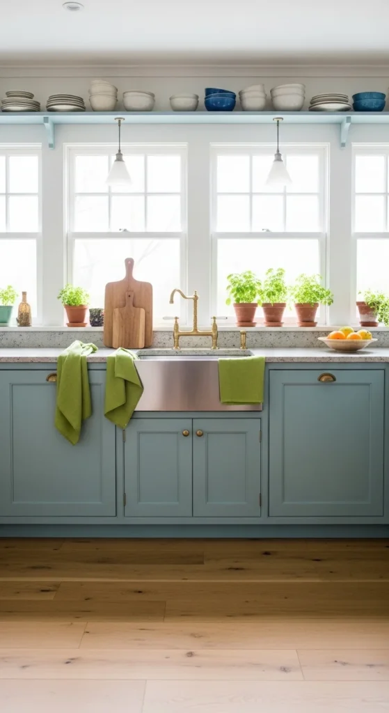
7. Mint Green and Cream
Mint green and cream feel refreshing and soft. This palette works well in kitchens, bathrooms, or reading corners. Use affordable textiles or decorative accessories in mint green, and keep walls or larger furniture neutral. DIY ideas include painting old planters mint green or creating cream-and-mint floral arrangements. Pair with natural materials like wicker baskets or wooden trays. Mint adds color without overwhelming, making it easy to decorate on a budget.
8. Blush Pink and Gold
Blush pink and gold feel elegant yet soft. Perfect for a feminine touch in bedrooms or living spaces. Add pink throw pillows, small rugs, or wall art, and complement with gold picture frames or vases. For DIY, paint glass jars with gold accents or create a blush-and-gold tabletop centerpiece. The combination is simple yet luxurious. Blush pink keeps it fresh, while gold adds warmth without taking over. This palette is ideal for small spaces needing subtle charm.
9. Aqua and Coral
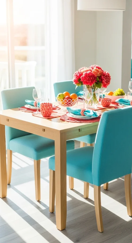
Aqua and coral feel playful and beachy. Perfect for spring dining or patios, this combination brings energy without being overpowering. Use cushions, table linens, or vases in these colors. DIY ideas include painting terracotta pots aqua or coral or creating mixed-color floral centerpieces. Pair with white or light wood for balance. This palette is budget-friendly—small décor swaps can transform your space quickly. Mixing the soft and bright tones keeps it lively and fresh.
10. Peach and Sage
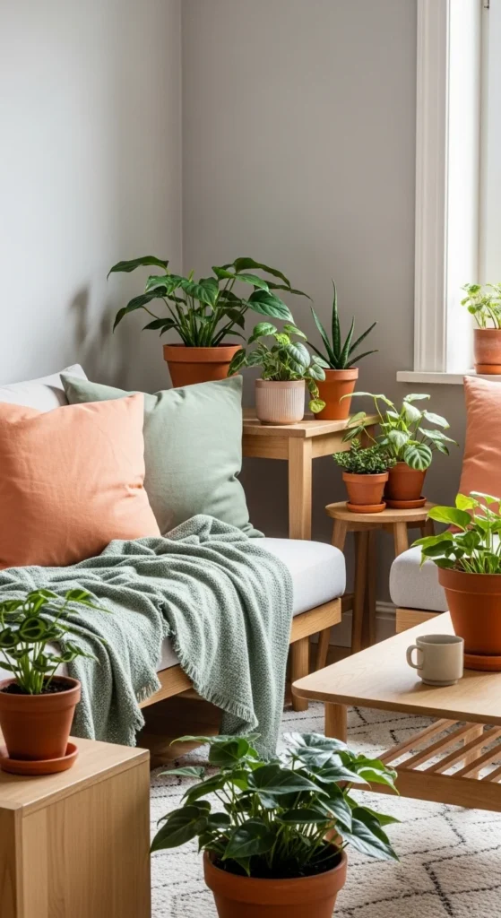
Peach and sage feel natural and calming. Ideal for living rooms, bedrooms, or entryways. Add sage throw blankets, peach cushions, or inexpensive wall art. DIY ideas include painting wooden trays or picture frames in sage or creating a small floral centerpiece in peach and sage. Pairing with neutral walls or furniture keeps the palette grounded. The colors work together without feeling busy. This soft, earthy combination is perfect for creating a relaxed spring atmosphere.
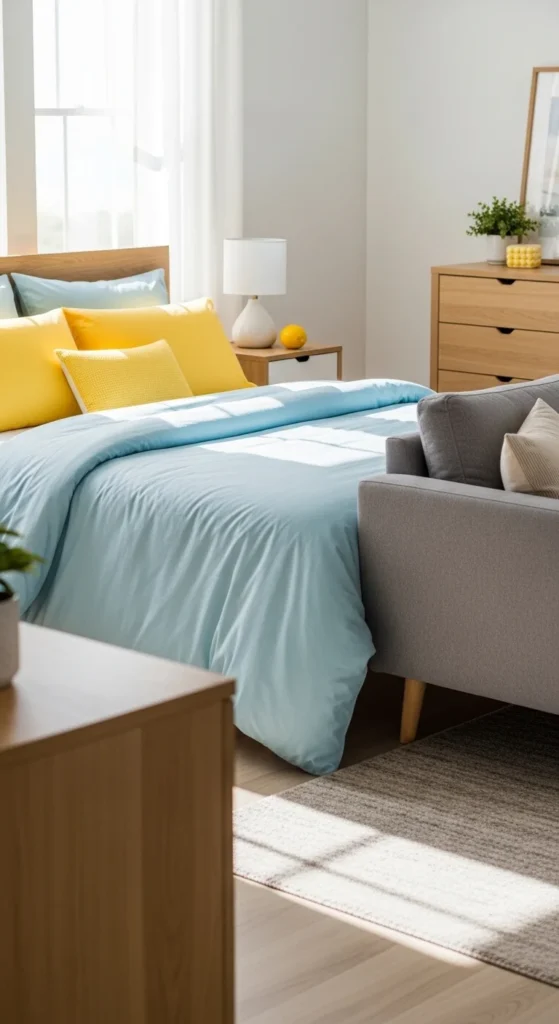
11. Sky Blue and Lemon
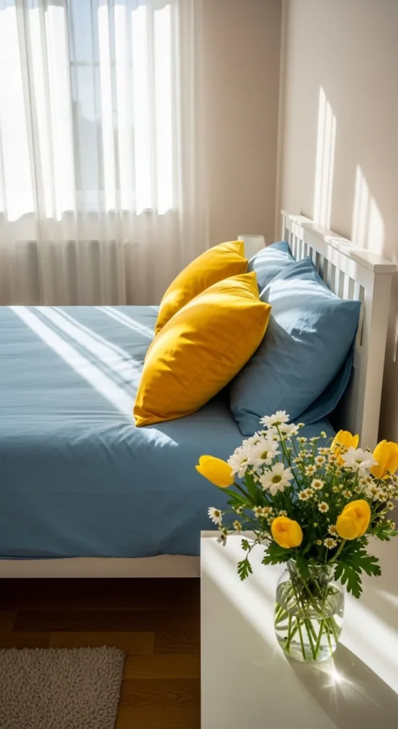
Sky blue and lemon create a cheerful, uplifting vibe. Perfect for bedrooms or kitchens, this palette pairs a soft, calming tone with a bright, energizing accent. Add yellow throw pillows, a lemon centerpiece, or small kitchen linens for instant impact. For DIY, consider painting picture frames or ceramic pots in alternating blue and yellow. Pair with white walls or furniture to balance the brightness. Even small details, like a blue rug with yellow accents, can transform a space. This combo works well in both large and small rooms, bringing a subtle sense of spring energy while keeping the atmosphere calm and inviting.
12. Peach, Coral, and Cream
Peach, coral, and cream feel warm and inviting. Use peach and coral on cushions, throws, or table accents, while cream anchors the space with furniture, rugs, or curtains. Budget-friendly updates include painting flower pots or small décor in coral shades or arranging seasonal flowers in cream vases. This palette works for living rooms, dining areas, or even bedrooms. Mixing three colors allows flexibility—cream keeps it light, peach adds softness, and coral pops for interest. For DIY, consider making a three-color wall gallery with inexpensive prints or painted canvases. This combination makes decorating easy without feeling overwhelming.
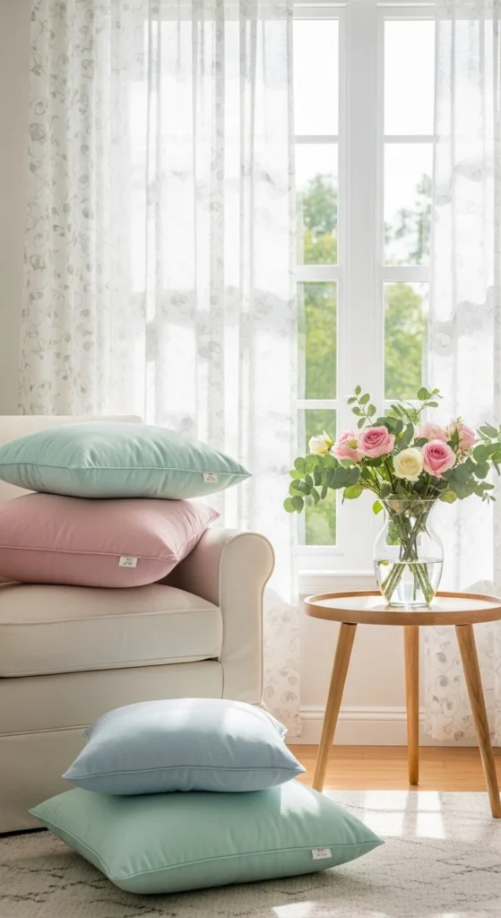
13. Soft Pink and Mint
Soft pink and mint are sweet and spring-ready. Ideal for bedrooms or reading corners, this combo feels playful yet soothing. Use mint blankets, soft pink cushions, and small planters for a budget-friendly update. For DIY, paint mason jars in mint and pink for decorative storage or make a pink-and-mint floral arrangement. Pair with light wood or white furniture to balance the pastels. This color pairing is subtle enough to decorate an entire room or just a cozy corner. Mixing pale pink and mint with natural textures adds depth and charm.
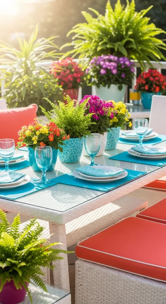
14. Turquoise and Coral
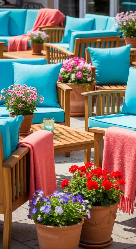
Turquoise and coral feel energetic and modern. Perfect for patios, dining rooms, or living rooms, this combo pops in small accents like cushions, table runners, or vases. DIY ideas include painting pots in turquoise with coral details or creating a coral-and-turquoise centerpiece. Pair with neutral furniture or wood tones to avoid overwhelming the eye. Even swapping small textiles or adding a few decorative objects in these shades can instantly refresh your space. Mixing bright turquoise with soft coral gives a vibrant spring feeling that’s approachable and easy to decorate around.
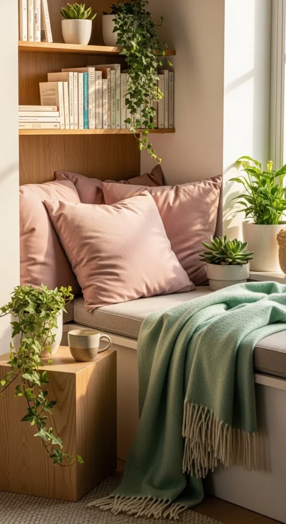
15. Sage and Soft Pink
Sage and soft pink balance calm and cheer. Use sage on larger items like chairs, throws, or table linens, and add soft pink accents with cushions, flowers, or candles. Budget-friendly options include painting inexpensive planters in sage or arranging a small pink floral centerpiece. This palette works in living rooms, bedrooms, or dining areas. Pair with natural textures like wood or wicker to complete the spring feel. Mixing muted sage with gentle pink creates a relaxed yet uplifting vibe, perfect for seasonal refreshes without heavy redecorating.
16. Lilac and Lemon
Lilac and lemon feel soft and playful. Ideal for bedrooms or workspaces, these shades bring subtle energy. Swap pillows, curtains, or small décor items to try this palette on a budget. DIY options include painting picture frames or candle holders in lilac and yellow or arranging fresh or faux flowers. Pair with white furniture for balance. Using a mix of lighter and deeper shades of lilac creates dimension. The cheerful yellow accent keeps the palette lively while lilac adds calmness. It’s perfect for those wanting a light spring refresh without major renovations.
17. Aqua and Lime
Aqua and lime are fresh and energetic. Use aqua as a base for cushions, cabinets, or rugs, and lime for small accents like towels, vases, or table décor. DIY ideas include painting mason jars or pots or creating a small aqua-lime centerpiece. Pair with white or wood tones to avoid clashing. This palette works in kitchens, bathrooms, or patios. Even swapping a few textiles can bring a big spring update. Mixing these colors feels modern and playful while remaining easy to manage in small spaces.
18. Buttercup Yellow and Peach
Buttercup yellow and peach create warmth and cheer. Ideal for living rooms or bedrooms, this combo is uplifting yet soft. Add small throws, pillows, or decorative objects to incorporate the colors affordably. DIY ideas include painting terracotta pots or arranging flowers in matching shades. Pair with neutral walls or light furniture to avoid overpowering the room. Using yellow as the pop color and peach as a soft anchor works well. This palette is budget-friendly, cheerful, and easy to decorate around, especially when combined with natural textures or white surfaces.
19. Coral and Turquoise with White
Coral and turquoise with white is a bold, spring-ready combination. Use white as the neutral base, coral for soft accents, and turquoise for playful pops. Budget-friendly updates include table linens, pillows, or inexpensive décor. DIY options include painting flower pots in these colors or creating a small centerpiece. This palette works well on patios, dining rooms, or living areas. Mixing these colors is lively without feeling chaotic. Adding a few natural elements like wood or greenery helps ground the palette. It’s perfect for making a space feel bright and festive for spring.
20. Lavender, Mint, and Cream
Lavender, mint, and cream feel soft, fresh, and airy. Use lavender for bedding or cushions, mint for smaller accents, and cream for larger furniture or walls. DIY ideas include painting planters or frames in these colors or creating a lavender-and-mint centerpiece. Pair with light wood for added warmth. This palette is perfect for bedrooms, bathrooms, or small reading corners. Mixing these three colors creates depth and a gentle spring vibe, making the space welcoming yet stylish. Small décor swaps in this palette make a big impact without spending much.
21. Aqua, Blush, and White
Aqua, blush, and white feel soft, airy, and modern. Use aqua and blush as accents in cushions, throws, or vases, while white grounds the space. DIY ideas include painting small wooden frames or jars or creating a blush-and-aqua floral centerpiece. This palette works in living rooms, bedrooms, or offices. Pair with light wood or neutral walls to maintain balance. The combination of soft pastels with a neutral base makes decorating easy and visually appealing. Swapping a few textiles or small décor items can bring a full spring refresh.
22. Peach, Mint, and White
Peach, mint, and white feel light and airy. Use peach for cushions, mint for smaller décor, and white for walls or larger furniture. DIY ideas include painting plant pots in matching colors or creating a small floral centerpiece. Pair with natural wood to add warmth. This palette works well in kitchens, dining rooms, or living areas. Mixing soft, light colors with a neutral base makes decorating simple and affordable. Even small accent swaps can refresh a room for spring.
23. Lemon and Sky Blue with Gray
Lemon and sky blue feel bright and playful, while gray keeps it grounded. Use gray as the base, sky blue for larger accents, and lemon for small pops. DIY options include painting frames, vases, or candle holders. This palette works well in living rooms, bedrooms, or home offices. Swapping a few textiles or decorative items instantly refreshes a space. The combination feels cheerful without overwhelming, and the neutral gray helps balance bright accents. Ideal for a budget-friendly, spring-ready update.
24. Mint, Lilac, and White
Mint, lilac, and white are soft, airy, and calming. Use mint for pillows, lilac for throws, and white for furniture or walls. DIY ideas include painting small décor items in matching colors or creating a mini floral arrangement. Pair with natural wood or light textiles to balance the palette. This combination works in bedrooms, bathrooms, or reading nooks. Mixing these three colors gives depth and maintains a peaceful spring vibe. Small swaps in textiles or plants can bring the room to life without large expenses.
25. Coral, Peach, and Mint
Coral, peach, and mint are playful and fresh. Use coral and peach as soft accents and mint as a cooler contrast. Budget-friendly swaps include pillows, throws, or small décor items. DIY ideas include painting terracotta pots in these shades or creating a color-coordinated centerpiece. Pair with white or neutral walls to prevent it from feeling heavy. This palette works in living rooms, bedrooms, or even patios. Mixing warm and cool shades gives a balanced, spring-ready vibe that feels lively and approachable.
26. Lemon, Peach, and Cream
Lemon, peach, and cream feel soft, bright, and cheerful. Use cream as the base, peach for accents, and lemon for small pops. Budget-friendly updates include textiles, vases, or seasonal flowers. DIY ideas include painting pots or frames in these shades or arranging a spring centerpiece. Pair with light wood or white furniture to keep the look fresh. This palette works in dining rooms, kitchens, or living areas. Even a few small décor swaps can bring a vibrant spring feel without spending much.
27. Lavender, Aqua, and White
Lavender, aqua, and white feel airy and relaxing. Use lavender as the main accent, aqua for smaller pops, and white for furniture or walls. DIY ideas include painting small frames or vases or creating a lavender-and-aqua centerpiece. Pair with natural textures to add warmth. This palette works in bedrooms, living rooms, or home offices. Mixing soft pastels with a neutral base creates a calming yet cheerful spring vibe, perfect for seasonal refreshes. Small swaps of textiles or décor items make decorating simple and affordable.
28. Peach, Blush, and Gold
Peach, blush, and gold feel elegant and warm. Use peach and blush for textiles and small décor, and add gold accents in candle holders, picture frames, or vases. DIY options include painting small décor in gold highlights or arranging a three-color floral centerpiece. Pair with white or light furniture for balance. This palette works in bedrooms, living rooms, or dining areas. Mixing soft colors with metallic accents adds warmth and subtle luxury without heavy redecorating.
29. Mint, Lemon, and Coral
Mint, lemon, and coral are fresh, lively, and playful. Use mint as the base, lemon for small pops, and coral for warm accents. Budget-friendly swaps include textiles, kitchen accessories, or small decorative items. DIY ideas include painting jars, vases, or trays in these colors. Pair with white walls or light furniture for balance. This palette works in kitchens, dining areas, or living rooms. Mixing warm and cool shades gives a cheerful spring feeling without overwhelming the space.
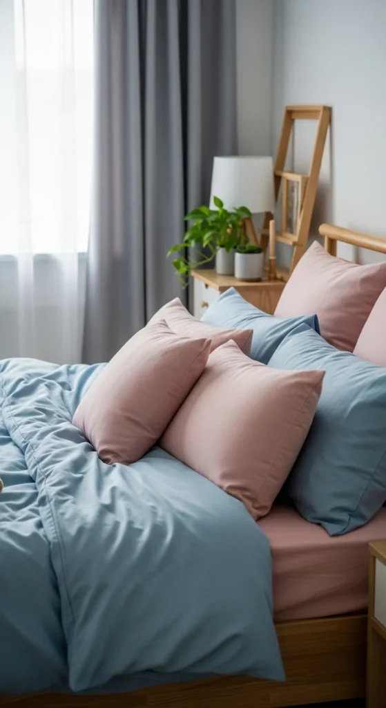
30. Sky Blue, Blush, and Soft Gray
Sky blue, blush, and soft gray feel calm, soft, and modern. Use gray as the base, sky blue for larger accents, and blush for small pops. DIY ideas include painting frames or vases in matching colors or creating a color-themed floral centerpiece. This palette works in bedrooms, living rooms, or home offices. The combination of muted and soft shades creates a balanced spring vibe. Even swapping a few textiles or décor items instantly refreshes a space, making decorating easy and affordable.
Conclusion
These 30 spring color palettes make decorating simple, affordable, and fun. Whether you love pastels, nature-inspired greens, or lively coral accents, each palette provides a practical guide to refresh your home. By swapping small décor items, painting DIY accents, or mixing textiles, you can create a cohesive look without overspending. Pick a palette that resonates with your style and start experimenting—spring is the perfect season to let color transform your space.

Leave a Reply